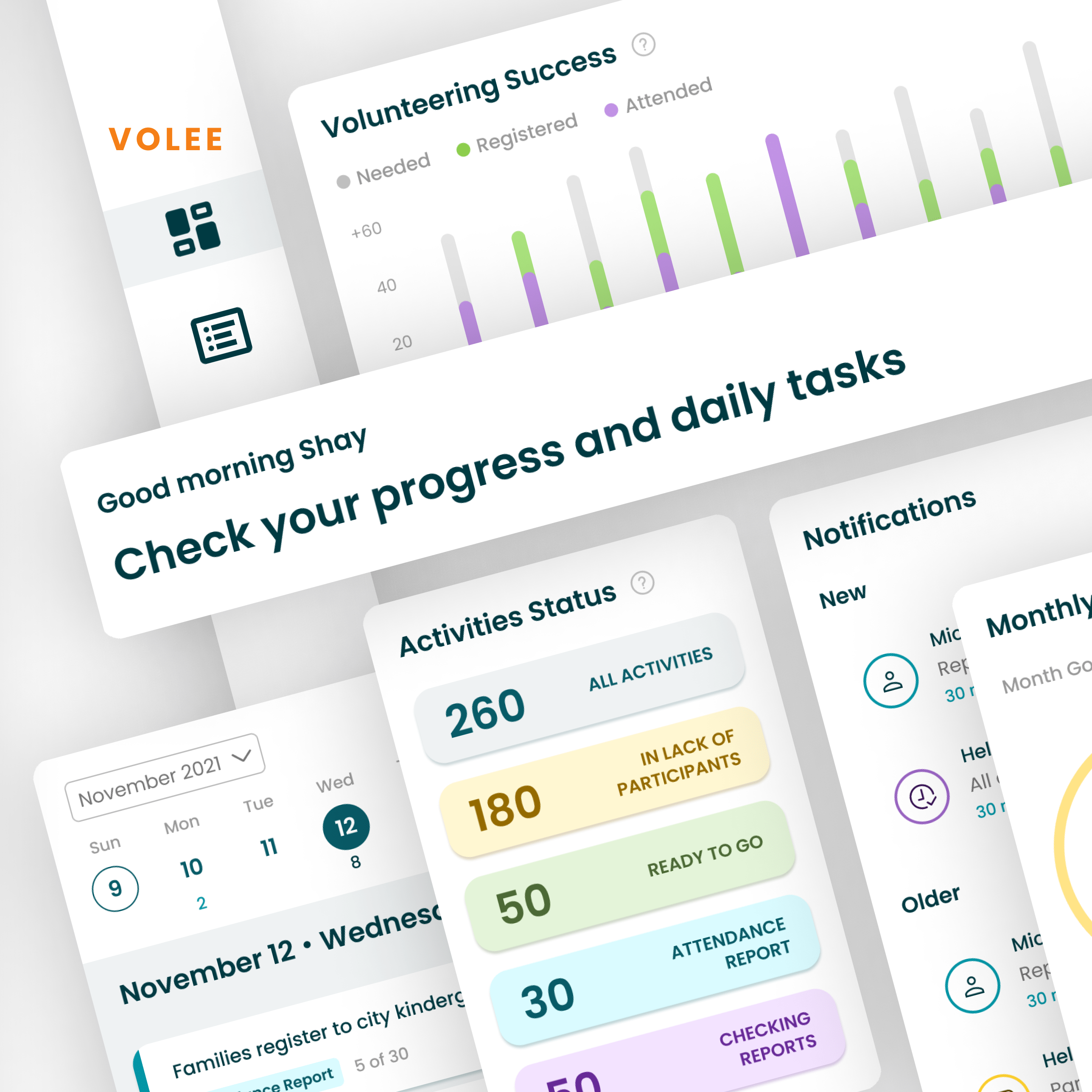
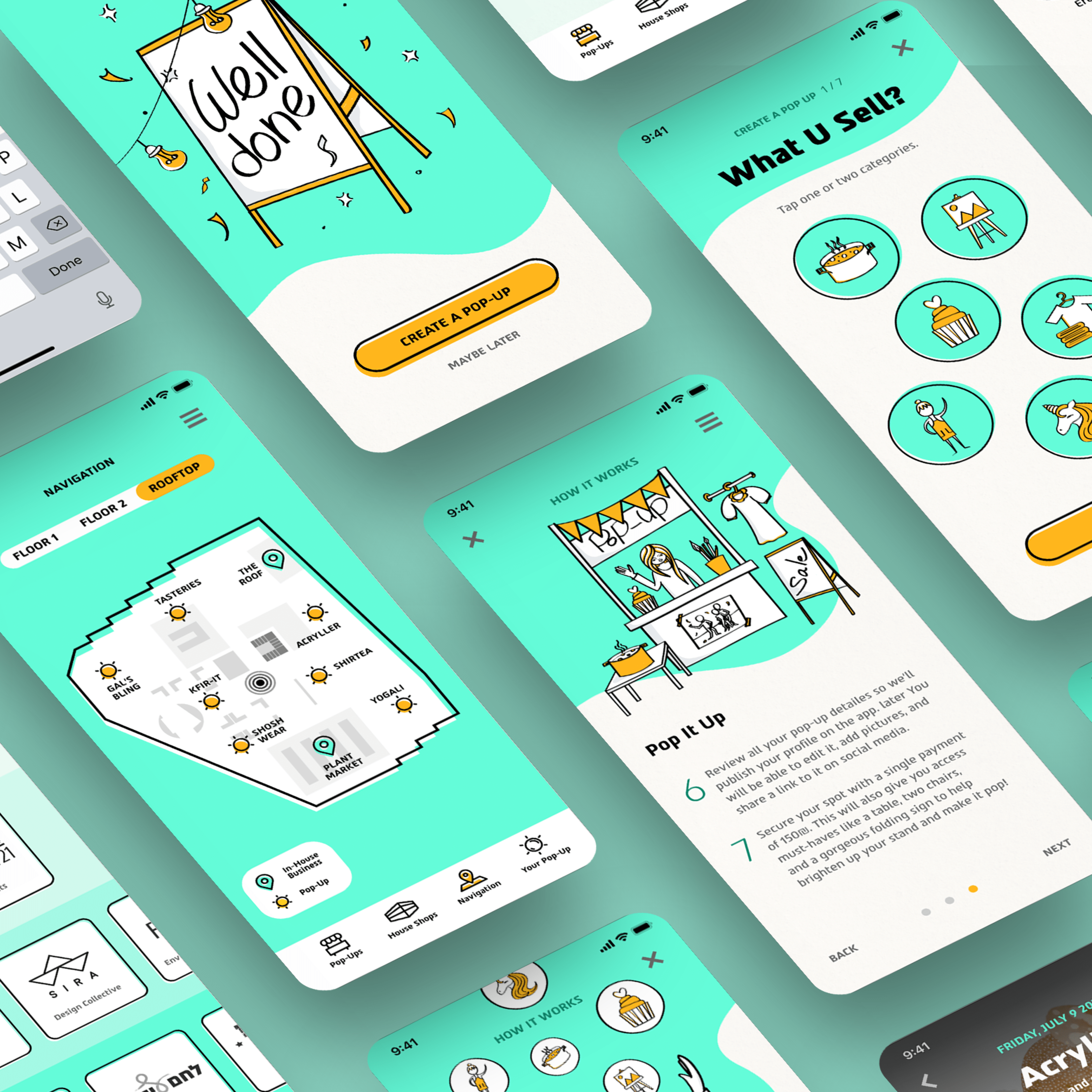
For this project, I was trusted with the task of driving the design of a brand new mobile app, end-to-end.
See below some highlights from my work – full case study coming soon.

Project Highlights
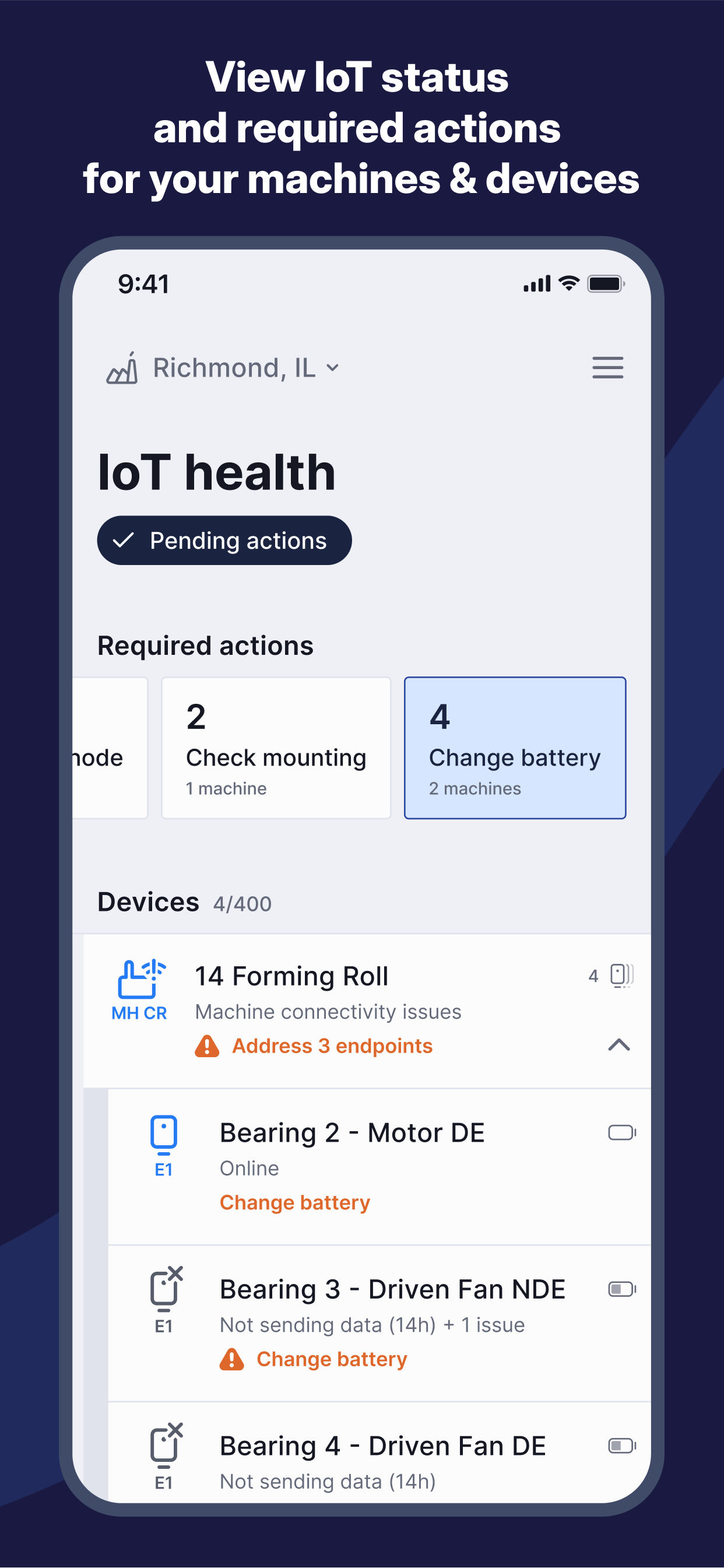
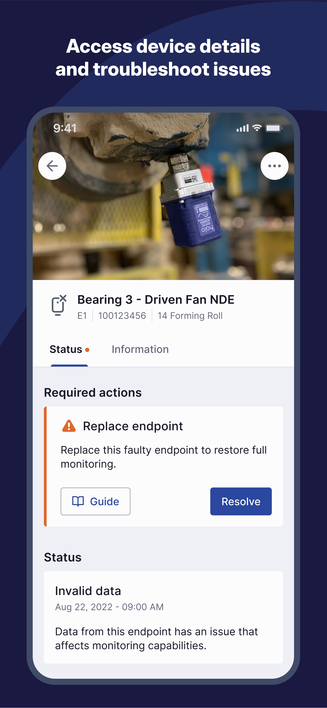
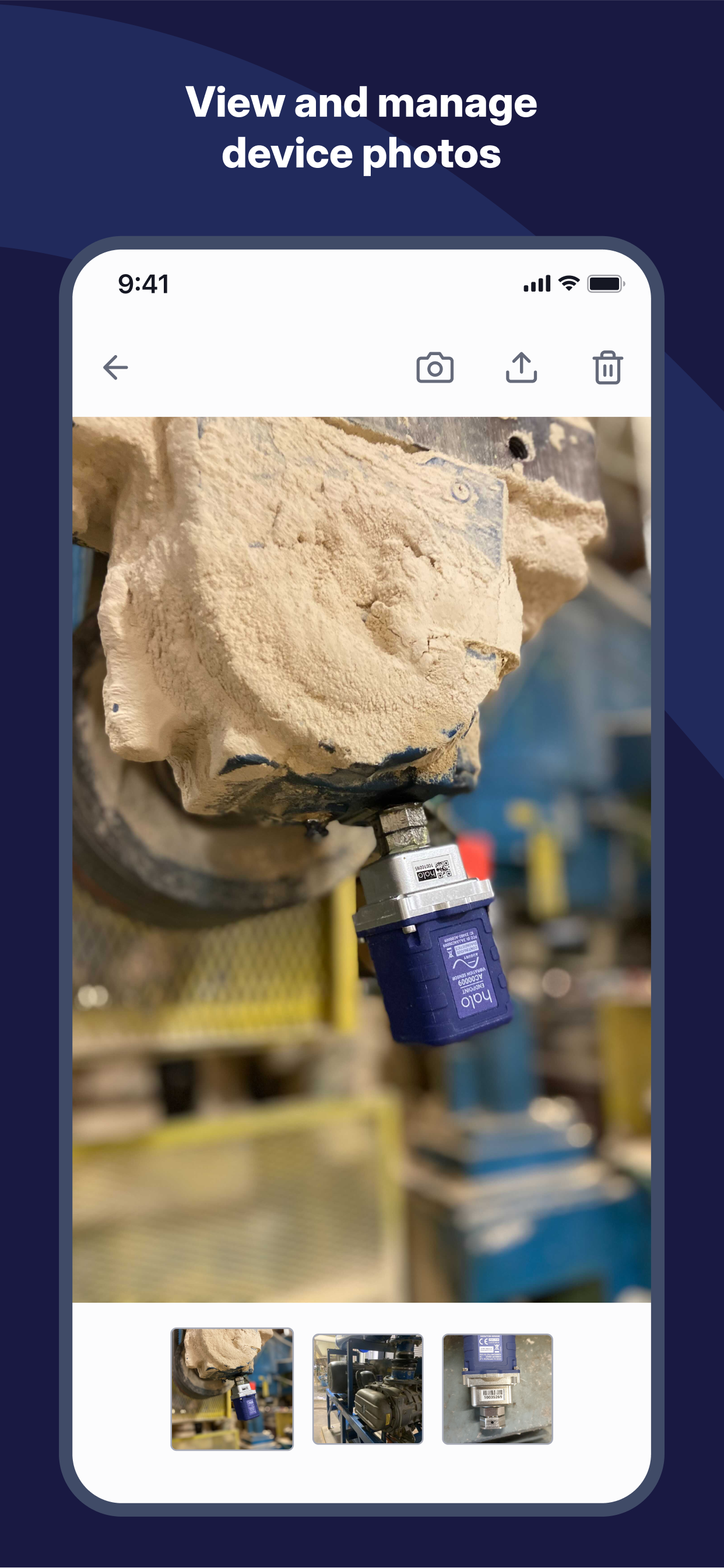
The brief was to develop both a vision and an MVP for a mobile platform that empowers customers to execute complex digital tasks directly on their factory floor, based on requirements from all product teams.
It all started as a collaboration with an external studio, which helped us map our complex array of personas and their journeys.
The project later became fully in-house, as I've led a design team sprint for finalizing a scalable information architecture and app navigation concepts into a very initial prototype, on which we could get basic feedback from stakeholders across the company, and ensure we are aligned with current and future desktop strategies.
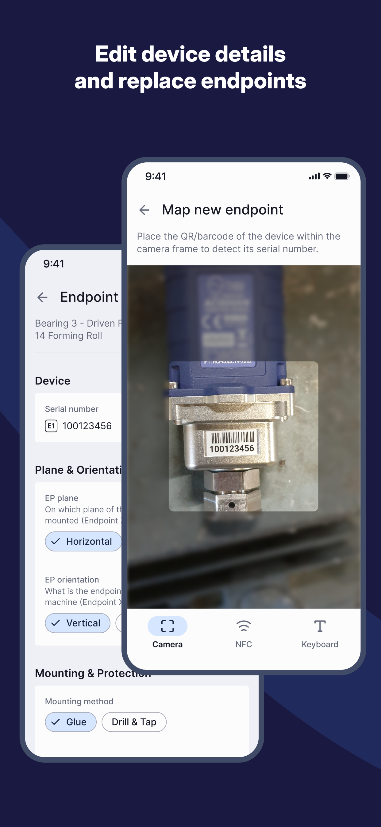
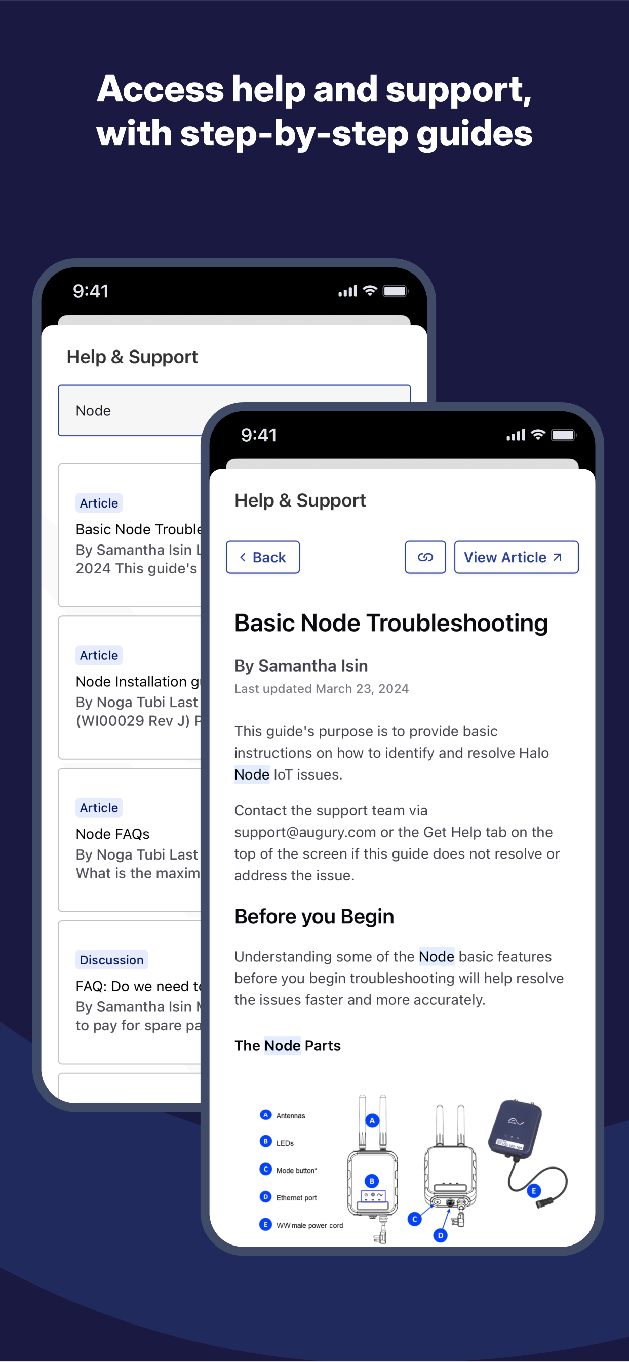
From there I've worked on adapting the vision to an MVP release version, streamlining existing flows from mobile-web, desktop-only, and internal mobile apps into a unified mobile experience, with a focus on customers ability to preform IoT maintenance.
I've established a new mobile design system based on Material Design (using the Flutter framework), harmonised with the latest company branding and the existing desktop design system. This included defining a compatible “WidgetBook” code library, and ensuring alignment between developers and designers regarding its structure and contribution process.
As more teams started working on adding their experiences to the new app, I've been introducing my fellow designers to the new mobile design assets and conventions, while guiding them on their new flows to maintain consistent and intuitive user experience.
